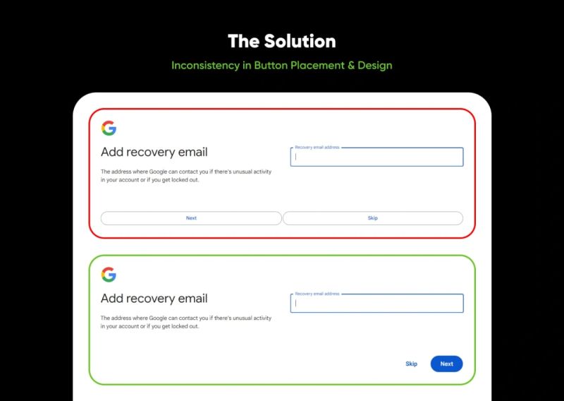
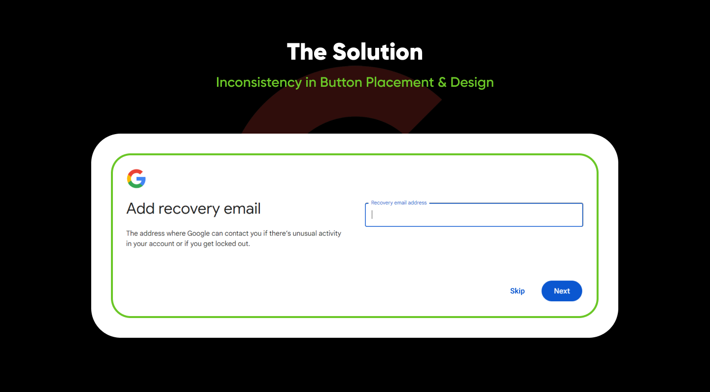
Following up on yesterday's post about Google's new login design, during account creation as I mentioned, the Inconsistency in placement and styling of the "Next" and "Skip" buttons.
🤔The Challenge:
Imagine accidentally skipping the recovery email step due to unclear button placement is not ideal.
**From Attached Image, First top in Red border represents UX Problem.
We want to ensure a smooth and intuitive experience for all users.
💡The Solution:
Based on UX best practices and user clarity, here's a proposed solution:
💡A image here showcasing the proposed solution: moved the "Next" and "Skip" buttons below the "Add recovery email" field, following the same Design language.
✨ Benefits:
👍🏻Clearer hierarchy: Separating the buttons from the input field creates a clearer visual distinction and emphasizes the sequential nature of the steps.
👍🏻Reduced confusion: Users can easily identify the purpose of each button, minimizing the risk of accidental actions.
👍🏻Improved user flow: The revised layout guides users through the process intuitively.
Remember, this is just one suggestion!
**What do you think? **
**Does this proposed solution address the button placement issue effectively?
**Do you have any alternative suggestions for improvement?
**Have you encountered similar UX challenges in other designs? Share your experiences!


 • 5 min read